My role
Product Designer
Team
Product Manager
2 Back End Engineer
4 Front End Engineers
2 QAs (acessibility)
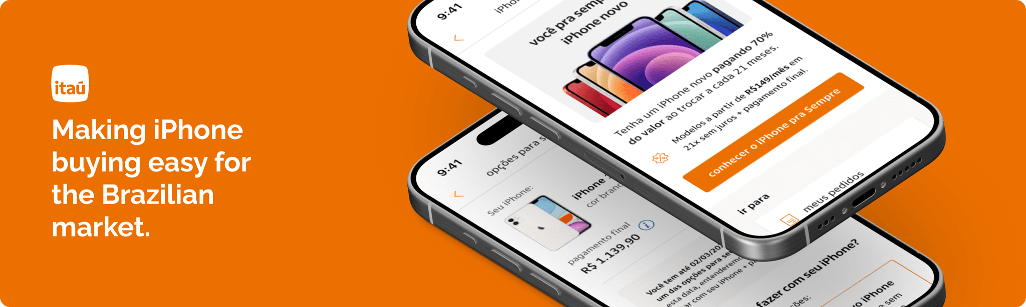
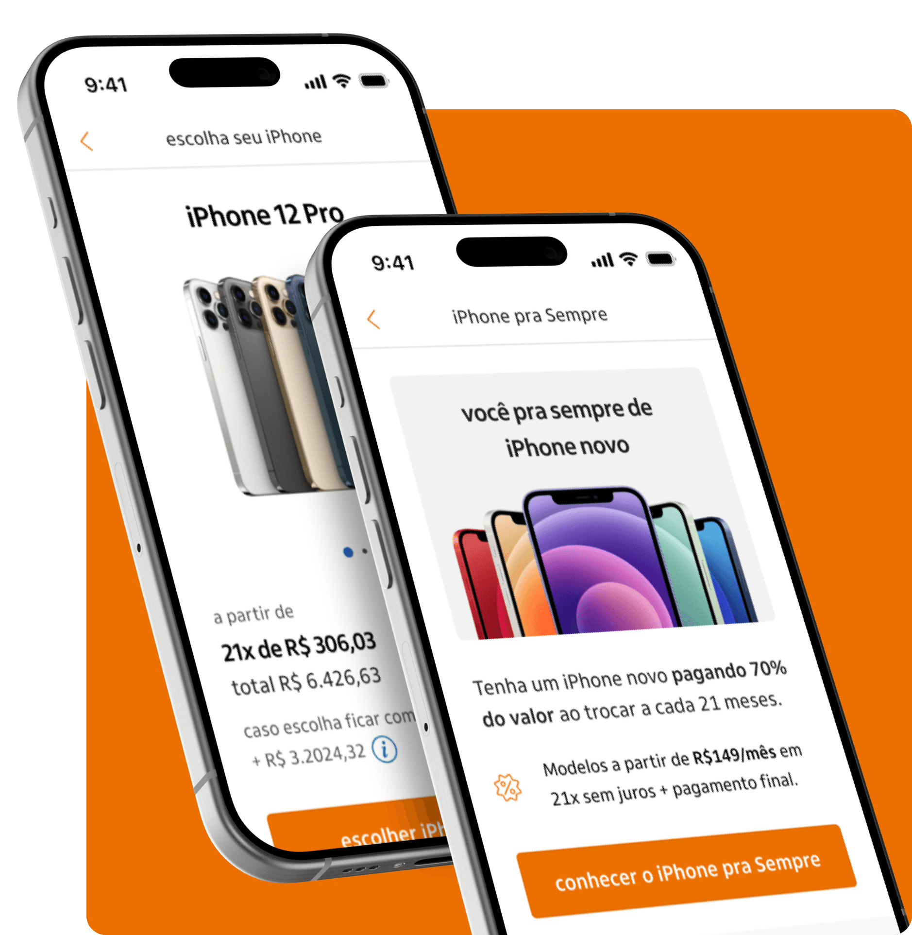
Apple Brazil
Design peers and
Researches
About
Itaú is one of the largest banks in Latin America, providing banking services for millions of customers via multiple channels, both physical and digital. This project is for their B2C context.
Project overview
Brazil has some of the highest iPhone prices in the world, making it difficult for many people to afford the latest models. To address this, Itaú launched a program designed to make purchasing an iPhone more accessible.
This case highlights my collaboration with Apple, and various stakeholders to design a seamless digital experience for key moments in the customer journey. Our solution delivered strong results, helping iPhone Pra Sempre become the top-selling iPhone digital commerce platform in Brazil at the time.
Context
What is the IPS (iPhone Pra Sempre) program all about?
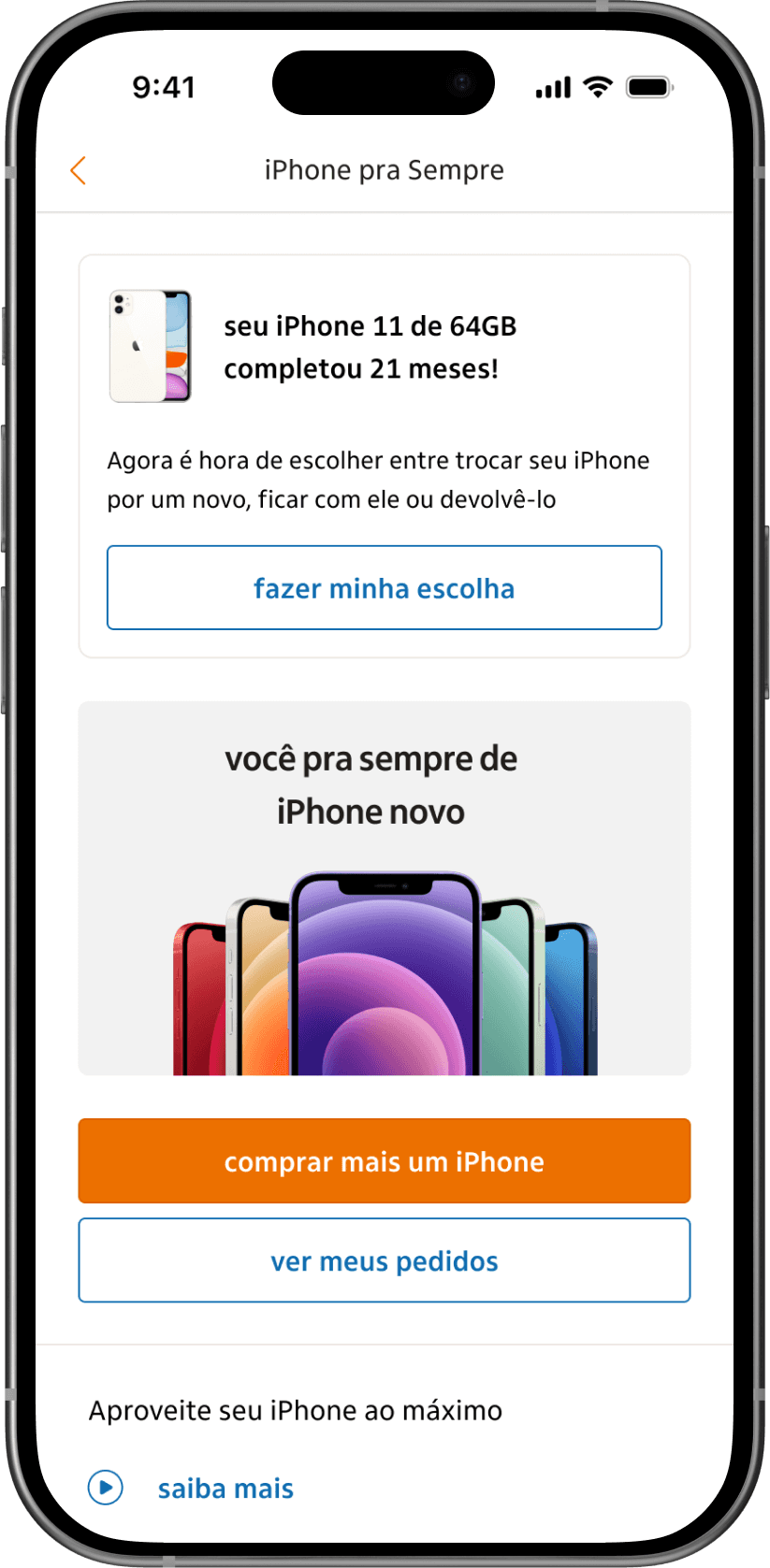
The program allows customers to purchase iPhones through 21 installments, covering 70% of the device's total value. After this period, in the 22rd month, customers can choose to:
Upgrade to a new iPhone, starting a new payment cycle.
Return the device and end the contract without paying the remaining 30%.
Keep the iPhone, paying the remaining 30% in a single installment.
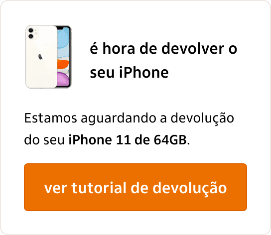
The process is fully managed through Itaú's app, with free return or exchange facilitated via postal services.
My role and case focus
The scope from the IPS project was divided into two main parts: the purchase experience and the decision-making process, where customers would choose whether to upgrade, return, or keep their phones. The first part was designed by other designers, and I joined the project to contribute to the continuous improvement of the core experience.
Over time, I became the sole designer responsible for leading the project, and the design of the decision-making process (second part). This phase was strategically planned post-launch, with a few months to deliver this critical part of the journey before the first customers reached the decision point. The case study highlights my contributions to creating the best possible experience for this key customer milestone.
Design process
Alignments and more alignments
The IPS project was highly complex, primarily due to the need for constant alignment with stakeholders, particularly those from Apple. With support from my PM, we first deepened our understanding of the project’s context, including its requirements, timeline, and expected deliverables. Given Apple’s strict guidelines and predefined processes, we had to carefully align with their expectations while also considering the bank’s needs, ensuring a balance between both sets of requirements.
Research and journey mapping had to run in parallel. While the overall journey was largely predefined based on existing guidelines, our research focused on optimizing the in-app experience and refining the IPS flow to enhance usability.

User journey
Defining processes and experience
This step required extensive collaboration with stakeholders from three key fronts: Itaú, Apple, and the logistics company. The logistics partner was a vital player throughout the entire program, from the initial delivery of iPhones when users first joined the program to the final stages of returns, condition assessments, and shipping new devices. Mapping the journey took time, as it was essential to align the workflows and ensure seamless touchpoints across all parties involved. This job had to be made for the 3 options available in the product: upgrade iPhone, return and keep it.

At a high level, the process would unfold as follows:
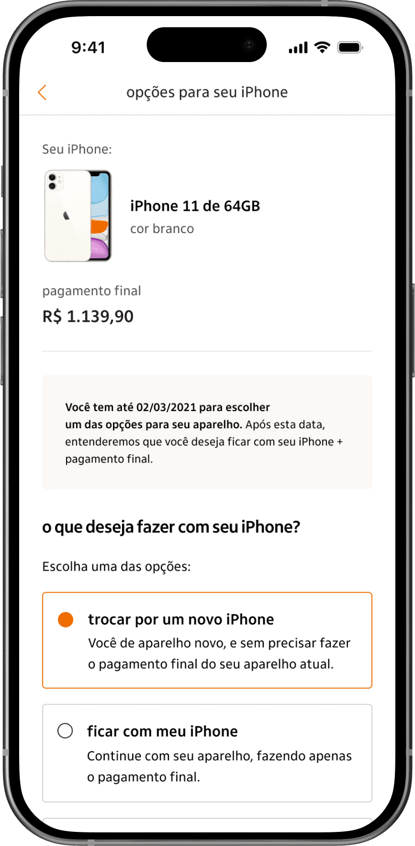
Step 1:
The user enters the decision phase and chooses one of three options: upgrade, return, or keep the phone.
Step 2:
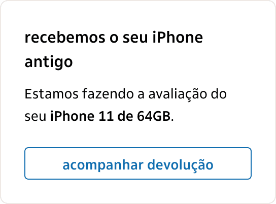
If they choose to upgrade or return, they provide the phone’s condition in the app. The phone is sent for inspection, and the condition review is shared with the user.
Step 3:
If the review matches their report and the phone is in good condition, the new chosen iPhone is sent, or future charges are canceled if they choose to return.
The iPhone's condition could be classified into three levels: good, poor, or non-working. For iPhones in poor condition, a repair fee applies. Non-working iPhones cannot proceed and would be returned to the user.
In the cases the user chooses to keep the iPhone, no logistics steps are involved. The user is simply charged the final payment amount for the phone.
All this mapping helped us to come up with three essential guidance points for the experience moving forward:
Establish a clear process to assess phone conditions, ensuring consistency and transparency.
Notify users about the 22nd-month decision window to prevent misunderstandings.
Provide transparent shipping and return tracking to reduce confusion and support inquiries.
Research
Users perspective
While mapping the journey, it was essential to validate key steps with users, explore their experience with the IPS (the buying process), and further assess their understanding of the product mechanics. We needed to ensure they clearly understood the actions required after the payment period. Presenting a high-level overview of the journey to IPS clients provided valuable feedback that helped refine the experience and address critical points.
The research phase included user interviews and online questionnaires, with support from a dedicated User Researcher, due the importance of the project and the amount of iterations needed.
Main findings
Product Understanding
Even at this stage, many users still had doubts about how the product worked, highlighting the need for a clear and transparent experience. This underscored the importance of effectively guiding users through each step of the journey.
Phone Returns
Users expressed concerns about the return process, particularly phone condition evaluations and associated fees. This emphasized the need for clearer communication and reassurance, as well as effective expectation management throughout the journey.
Prototyping
Prototyping and validation
The prototypes underwent extensive user testing, which helped refine the screen flow and, more importantly, improve communication to guide users through key steps, such as the phone evaluation. All validation rounds were crucial in addressing the challenges identified during the research phase.
4 main journeys
for the options to upgrade, return, stay with the phone and cancelation.
45 + screens designed
including edge cases, error states and inumerous elements variations.
3 user test rounds
with aproximatelly 5 users each, to make sure the designs were effective.
Clear decisions prompts
We ensured that communications about the decision-making period were clear and integrated across various points in the user journey. Modals were used to inform users about their current stage in the process, providing clarity and guidance.
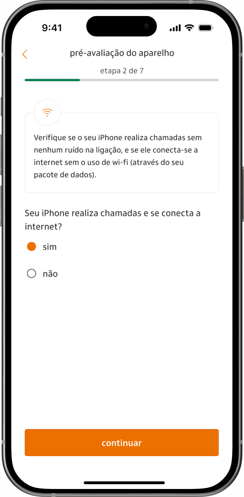
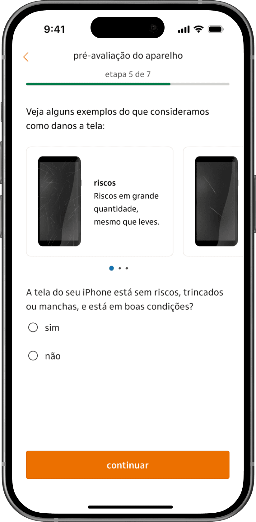
iPhone pre-evaluation
To make the iPhone condition pre-evaluation process effective, I worked with users to understand their interpretation of each question in this step. This approach ensured the design minimized confusion, making it easier for users to provide accurate responses.
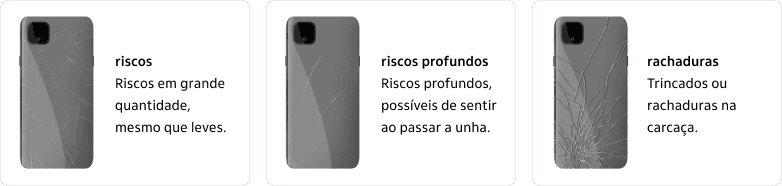
For questions about the physical condition of the iPhone, illustrations were added to clarify the topics.
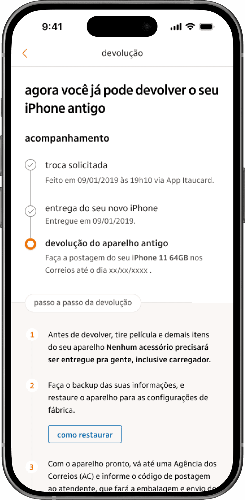
Informative process timeline
Understanding the importance of transparency and step tracking for users, I designed a timeline that clearly displays completed steps and the current stage of the process. For touchpoints that required a deeper understanding, I added elements to break down each step, ensuring users had clear explanations and a smooth path forward.


Learnings
Level up
People are sensitive when money is involved, making uncertainty challenging to navigate. Engaging closely with users to understand their motivations for purchasing an expensive item like an iPhone, and identifying potential deal-breakers, was key to shaping our communication strategy at every step of the journey.
Systematic design was essential. In a journey with so many different screens and possible outcomes, maintaining consistency was crucial both for an effective workflow and for users. This approach helped avoid breaks in the experience, allowing users to feel familiar with the process and navigate more easily through each step.