Este case será traduzido para português em breve ;)
My role
Product Designer
Team
Product Manager
Back End Engineer
2 Front End Engineers
2 QAs (acessibility)
Partnership with +1
Designer and
Researches
About
Itaú is one of the largest banks in Latin America, providing banking services for millions of customers via multiple channels, both physical and digital. This project is for their B2C context.
Project overview
Itaú recognized the importance of credit cards in Brazilian daily life and introduced a new feature to enhance customer convenience and financial flexibility. This feature lets customers pay bills directly with their credit cards, extending payment deadlines and streamlining the payment process.
This case shows our commitment to validating the feature’s value through thorough user research and testing, leading to a 15% increase in conversion after improvements were applied.
The screens and content in this case study are shown in Portuguese, the original language of their creation.
Context
Brief introduction
A bank slip, known as a "boleto" in Portuguese, is a popular payment method in Brazil. It is a printed document containing a barcode that can be used to pay for purchases, bills, or services. Customers can pay these slips at a variety of locations, such as banks, lottery agencies, and payment kiosks. Recognizing its importance, Itaú identified an opportunity to enhance customer convenience and generate additional revenue. By enabling customers to pay bank slips directly with their credit cards through the Itaú app, the bank aimed to streamline the payment process and offer flexibility to users.
Our team was tasked with creating a user-friendly mobile experience for this new feature, ensuring it met both customer needs and business expectations.
Feature main mechanics
A bank slip is created, with a due date set for two days (or more) from the issue date.
To extend the payment deadline, the client could choose to pay the bank slip using their credit card through the Itaú app.
Instead of paying it within two days, the amount would be charged as part of the client’s monthly credit card statement, extending the deadline by up to 30 days.
While the core product strategy—covering profitability, operational details, and overall value to the bank—was determined by a separate team focused on banking products and services, my team was responsible for designing and developing the mobile experience within the app. Revenue would be generated through transaction fees, which introduced the challenge of ensuring transparency for users. Addressing this challenge became a key focus of the project, and the strategies for achieving clarity and trust are explained throughout the case study.
Design process
Internal insights
To meet the project's deadline, it was important to first consider the main steps necessary for this project.

Kick-off and context deep dive
My team and I collaborated with various stakeholders across the bank to align their vision and expectations for this new feature. This process provided a clear understanding of the project’s origins, significance for the bank, and initial insights into user needs and hypotheses. It also sparked core team discussions, where the Product Manager helped define the project’s scope, timeline, expected deliverables, and feasibility.
At the same time, we conducted a competitive benchmark to analyze how the market was offering this feature. Additionally, we ran a SWOT exercise to identify potential differentiators and challenges, helping us position our solution effectively.
My team and I collaborated with various stakeholders within the bank to gain a comprehensive understanding of their vision and expectations. This process helped us grasp the project's origins, its significance, and gather initial insights into user needs and hypotheses. To further solidify the project's foundation, I conducted exploratory discussions and benchmark analyses.
Research
Engaging with customers
With a solid foundation of insights, I moved into the research phase, engaging directly with real users. Partnering with a User Researcher, we defined scripts, set goals, and conducted five user interviews to explore their perceptions of bank slips and payment behaviors.
These conversations highlighted potential challenges that could impact the project’s success: the risk of low engagement due to fees and the complexity of explaining how the product worked. Recognizing the need for further validation, we conducted additional research using an online platform available to the bank, allowing us to reach a broader audience. In this phase, 32 users participated in our online study, helping us dive deeper into these concerns.
Main findings
User payment journey & understanding of payment methods:
Many users struggled with paying their bank slips on time, often forgetting due dates. Additionally, there was a general lack of awareness about the various rules governing both bank slips and credit cards.
Reaction to the product proposition:
• Most users found the product concept difficult to understand when first introduced to them.
• Many expressed concerns about the proposed fees, often comparing them unfavorably to competitors.
• Some users referenced competing services, highlighting when and why they chose them, primarily due to better pricing and conditions.
User feedback revealed concerns about the fee structure, which impacted the product's perceived value. Our main hypothesis at this point was that addressing this would improve conversion rates.
Experiment
Route recalculation
Armed with valuable user insights, we collaborated with internal stakeholders to address concerns about the product’s value proposition and the impact of high fees on adoption. While we secured support from other product teams, resource constraints—along with the lack of large-scale qualitative data—limited our influence on decision-making.
To strengthen validation and gather quantitative data, I proposed a fake door test within the app. This approach allowed us to quickly assess user interest and gauge their willingness to pay the associated fees.


Results
186 thousand
Iterations with the fake door.
61%
Showed interest in the product by clicking on "I want to know more" in the first screen.
21%
Showed interest in the product on the second screen, where the fees were shown.
42%
Chosen the option "no fees" in the third screen, with cashback in second position.
Conclusion: The fake door test confirmed that paying bank slips with a credit card held strong value for clients, but when users encountered the high fees, interest dropped significantly, highlighting fee sensitivity as a key adoption risk. These findings showed the need to adjust the fee structure. Although discussions took place, tight time constraints and a fixed launch date prevented us from making changes before the initial release, which impacted the feature's results and the bank's adoption targets. However, thanks to our research efforts, we were able to revise the fees after launch, leading to improvements over time.
Prototyping
The show must go on
While discussions on the core value proposition continued, I advanced the design process, focusing on defining the deliverables with the team, refining the user experience, and validating key decisions. This phase required close collaboration and extensive testing. Some of the mains steps:
User journey: Outlining each step and interaction users would have with the feature.
Technical feasibility: Alignments with the development team to identify technical constraints and opportunities.
Accessibility: Ensuring together with the Acessibility QA Team that the feature met WCAG standards to be fully inclusive.
User Testing: 6 rounds of testing with real users were conducted, supported by a User Researcher. Additionally, we ran content-focused validation sessions through online tools, asking users to analyze the screens and describe their understanding, with the goal of refining the copy and make it as clear as possible.
Screen flow overview
The user journey was carefully designed to provide clear, step-by-step instructions, a straightforward explanation of the product's functionality based on user feedback. The barcode reader also had a lot of love, since it was an essential part of the experience. During development, we tried to adress all potential issues mapped, such as unsupported bank slips and error messages. This approach ensured a reliable user experience, even in uncommon situations.
Solution
Final layout examples
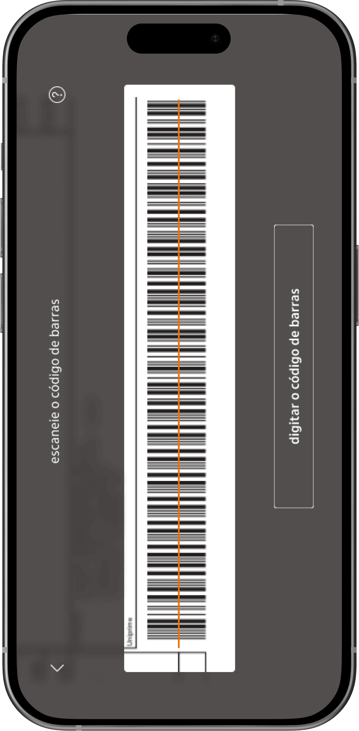
Barcode scanning
This screen uses the smartphone camera to scan the barcode from the bank slip, a feature familiar to users, especially those using competitor products. Our design emphasizes accessibility by supporting both vertical and horizontal barcode scanning, since limiting it for one single position could affect user with motor disabilities. Additionally, a button allowsed users to manually enter the barcode number, providing an alternative option for greater user flexibility.
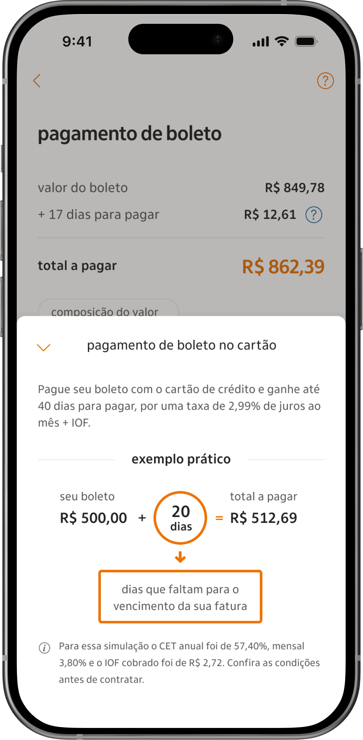
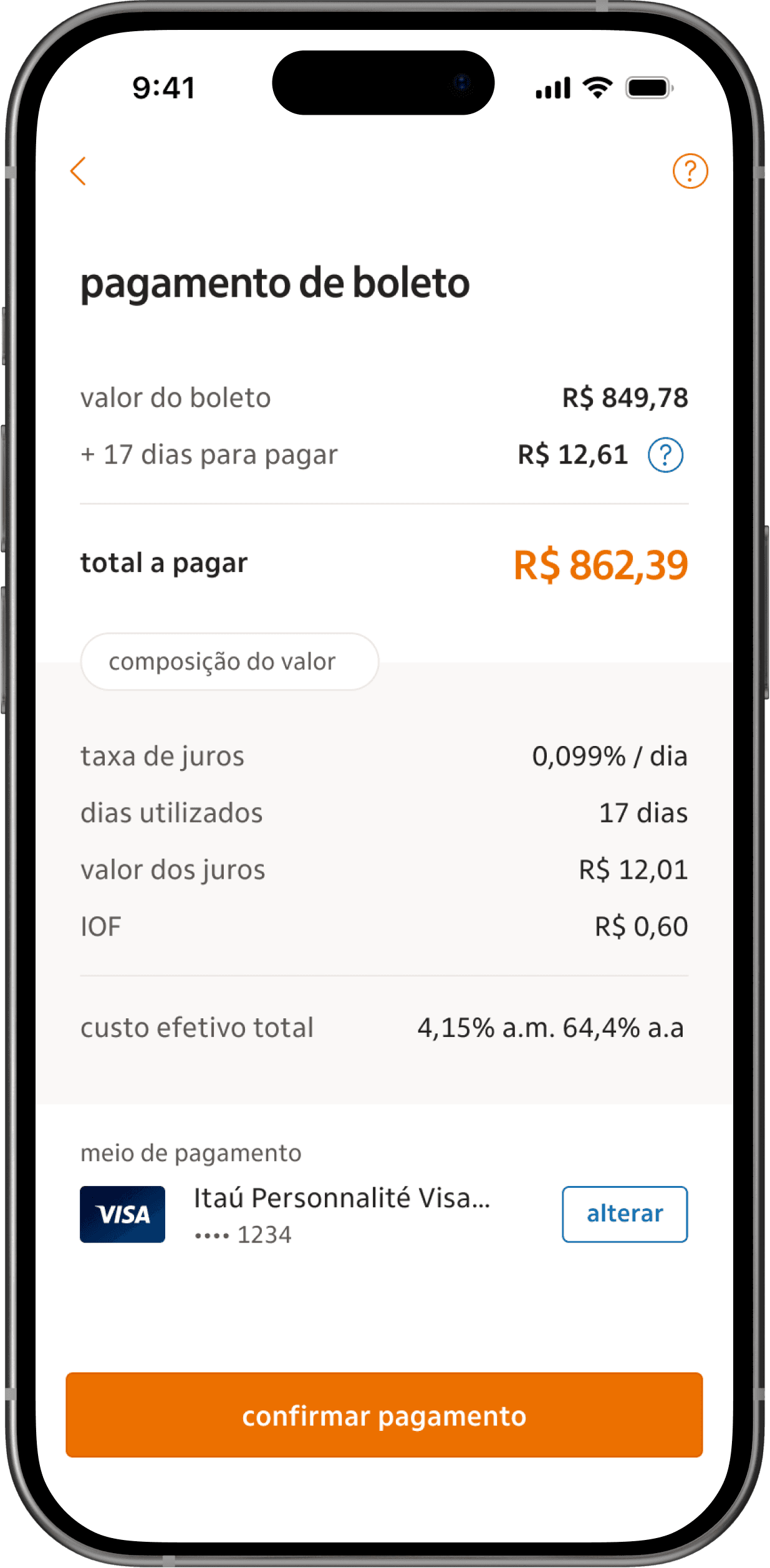
Fee breakdown for more transparency
These screens provides users with a clear breakdown of the fees associated with the credit card payment feature. To ensure transparency, fees are first explained through an example with a fake and easier value, in a modal acessible by the help icon. In the checkout screen, the real, applicable fee is displayed, showing step-by-step the exact amount the user would pay. Extensive user testing was conducted on these screens, with a strong focus on clarity and precision in the copy to address fee-related questions effectively.
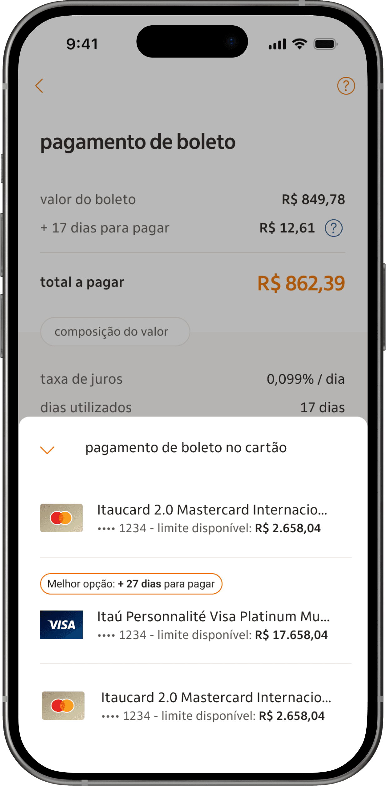

Smart suggestions
Based on our initial data findings, we discovered that most of the bank’s clients had more than two credit cards, and a significant number frequently maxed out their limits by the end of the month. This presented an opportunity to assist users by highlighting which of their cards would be the best option for payment, considering both available credit and the number of days until the due date.
Impact
Feedback and impact
This case study shows the value of a user-centered design approach, even when facing challenges. Although the product launched on time despite some concerns about its value, our user research and advocacy led to improvements after launch.
71 thousand
Payments were made by clients in the first 2 months (almost 40% less than expected).
around +15% in total payments
Following the implementation of fee adjustments after launch, and improvements to the product's value proposition.